Author Archives: admin

I-SITE Seeks Spring/Summer Interns

I-SITE [www.i-site.com], an award-winning interactive design and technology firm located in the heart of Old City, Philadelphia’s creative community, has immediate openings for highly-motivated interns who are passionate about interactive design and development.

As an I-SITE intern you will have the opportunity to gain experience working on all facets of our web and mobile application projects in a collaborative studio environment. Our clients are for-profit, non-profit, national and international and include Alliance for Downtown New York, William Penn Foundation, the Wilma Theater and the Times Square Alliance.

Requirements for the internship:

–        Enrolled or recent graduate in a digital design, multimedia or equivalent program

–        Proficient with HTML, CSS

–        Familiar with Photoshop and Illustrator

–       Knowledge of Web Design trends and UX a plus

–        WordPress, Drupal, JavaScript or PHP knowledge (a plus)

–        Interest in mobile site / app development

–        Have a portfolio site that shows off your potential

–        Strong desire to be part of a team and learn new things

This is an ideal opportunity for a junior, senior student or recent graduate looking to up their game and push their boundaries.

This is a paid internship requiring a minimum of three days a week at the I-SITE office.

Interested candidates may contact join [at] i-site [dot] com with a cover letter and portfolio link(s).

No phone calls or recruiters or out-of-towners please.

Note we foster cats in our office as part of our KATO, Kitty at the Office program. This position would not be suitable if you are highly allergic.

Dave Exposed

Expertise:
Humans. I’ve always had a natural aptitude for figuring how I relate, or connect with other people. I’m also very good at most Hasbro games. No big deal.

Tools of the trade:
Google, Google Drive, Google Docs, Google Sheets, Google Calendar, Google Mail, Google+, and a can-do attitude.
Totally kidding about the Google+ part. I’m not an animal.

What have you learned about yourself and your development style since beginning your internship:
If we think of an existing code base as a big family get-together, I feel like my development style has evolved from politely listening to all of crazy uncle Drupal’s wild tangents about the goings on of his children (and his children’s children…and his children’s children’s children…), to ignoring most of the BS, and cutting straight to the relevant details about how I can get his descendants to do my bidding. As far as what I’ve learned about myself, it turns out I’m a shallow, terrible relative.

What’s your favorite holiday toy or memory?
My favorite holiday memories don’t revolve around toys and gifts, per se, but the anticipation of toys and gifts, and then the utterly carefree activities that round out the day. It was the no sleep on Christmas Eve because I couldn’t get my heart to stop pounding through my jammies like I was being chased by a medium-to-large sized jungle cat. The hunting for the largest box with my name on it, and then the tearing through it like a Midwestern, suburban savage. It was the showing off of my haul to neighborhood friends, and the snowball fights, and the sledding…SO MUCH FEELZ

What are some similarities between coaching and coding?
Both involve a desired end result, which require concise, yet thorough communication in order to achieve said result. I can’t just say to my players, “score goals,” or “be in the right position” and rightfully expect success to follow, just as I can’t type “Do the thing” into my text editor and rightfully expect a fully functional, awesome looking app. In both cases, I need to make the right kind of sense. And in both cases, it’s easy to tell when I’ve failed to do so.

Dream project:
Something involving machine learning. My favorite class in college was Philosophy of Mind, which grappled with issues pertaining to the nature of (spoiler alert) the mind and mental properties. I’m fascinated by the advancement of programs capable of tweaking their own programming, and the implications that these advancements may have on how we define notions such as identity and consciousness, and potentially how we view our place in the world moving forward.

Future technology prediction:
My hope is that we get to a place within the decade with driverless car technology such that people are no longer allowed to manually operate their own vehicles. If you’re reading this thinking, “but I couldn’t possibly trust a computer to safely navigate me to all of my many destinations,“ I invite you to research the current number of automobile-related deaths/year. It falls somewhere between guns and cancer, and really is a massive problem to solved. So there’s that. I’d settle, though, for a bot so in tune with my needs and tendencies that it knows I want an everything bagel with extra cream cheese approximately 30 minutes before I do, and then automatically places the order for me. And pays for it. It’s the least it could do.

April Exposed

Skills:

I started college as an art major, finished with a biochemistry degree, and went on to work in web development – my skills range from design to cloning DNA to HTML/CSS. More broadly, I enjoy challenges that involve creating a product out of theory, logic, and deduction.

Tools of the trade:

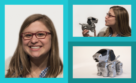
Google. And Chrome Developer Tools, which I sometimes spend more time in than the actual website I’m working on. Since I like to break things, Git is invaluable to me. More importantly, @EmergencyPuppy, the occasional pizza break, and a french press mug equipped with 95 mg of caffeine is where I get all of my power.

What is your development style?

When I first started out, it would be to start tweaking things and see what breaks. Lately I’ve been less adventurous but more efficient – careful planning and research goes a long way in writing clean and organized code.

What makes the perfect client?

The perfect client has a solid vision for their project, but isn’t looking to micromanage you or stifle your creativity. A perfect client is more of a partner – both parties bring their strengths to the table and work together to create a beautiful product with a strong backbone.

How is chemistry like web dev?

Binary is the atomic structure of the computer world. These units form logically to create a larger comprehensible unit that can combine with another unit, and so on. Eventually, these units can form a beautiful and complex system. And if at some point they don’t make sense, they either don’t sustain themselves or simply blow up.

How do traditional zines stack up against blogs and Tumblr?

Both are great mediums, but I don’t know anyone who has put together a zine about a topic that didn’t feel passionate about it (meanwhile, my Tumblr is full of Spongebob GIFs and cat memes). Also, zines are inherently therapeutic for both artists and readers – when was the last time you put together something with your own hands or received someone’s personal creation in the mailbox?!

Dream project:

I would love to work on more projects with data visualization and/or mapping. With all of the data (and data visualization tools) available to us, there’s always something to be learned!

Future technology prediction:

3D PRINT ALL THE THINGS! The cost of 3D printing is rapidly decreasing and eventually it will be more efficient to print something yourself rather than ordering it online or offline. We can even print organs! I wouldn’t be surprised if, further down the road, 3D printers became as commonplace in the household as the inkjet printer is today.

I-SITE Wins IMA and IAC Awards

I-SITE has received accolades in the 2014 Interactive Media Awards, Internet Advertising Competition and Appys for a number of recent projects.

Firstly our interactive holiday card for pre-school TV network Sprout won Best Family Website at the Internet Advertising Competition. The website features original illustration and parallax scrolling, and was designed and developed by the I-SITE team to encourage votes in Sprout’s Kindest Kid competition. The website also won an Outstanding Achievement Award at the 2014 Interactive Media Awards.

2014_awards

I-SITE also won a Best in Class Award at the 2014 Interactive Media Awards for the the redesign of the website of green architects Re:Vision. The website was one of only four entries to receive this accolade.

Finally apeAPP, I-SITE’s innovative iPhone and Android mobile application for the Great Apes Survival Partnership [GRASP] was nominated as a Finalist at the 2014 Appy Awards during Internet Week in NYC in the Reference category. Ancestry.com ended up taking home first prize but you can be sure we will be encouraging the organizers to include a Conservation category in next year’s awards.

Of course we’re proud of the achievements but especially happy for our clients who worked alongside us in making these innovative digital products.


Alex Ruse Exposed

Ruse Exposed

Skills:

Back-end and front-end development, cross-browser optimization, juggling.

Tools of the Trade:

Text editor with syntax highlight, browser developer tools, version control software, headphones, and a notepad and a pen.

What is your development style:

Careful planning and rapid deployment with a healthy dose of perfectionism.

What project are you most proud of:

A Tetris clone written in assembly language in 2000. In one night.

Most recently – apeAPP, not only an interesting and challenging project to work on, but also for a good cause.

Dream project:

I’ve had several over the years: “smart home” hardware/software (2001), mobile websites (2004); today it would be something that can actually make a difference in the real world.

Future technology prediction:

Not-so-ugly and actually functional wearables that eventually will surpass their infant gimmicky stage.

What are the parallels between Soccer and Programming:

You need to plan several steps ahead, anticipate what can possibly happen before it does, and adapt quickly to changes.

And while coding I do a lot of typing.

Who do you think is going to win FIFA World Cup?

As we are nearing the knockout round in the first week of July, the group stage was already one of the most entertaining sporting events in recent memory (I’ll say last 20 years), and the best part hasn’t even started! Upsets, surprises, tons of goals, probably the fastest scoring/counter-scoring in recent history, controversial calls (and no-calls), biting, among other things… at this point I’d have to go with home advantage of Brazil, but in football anything can (and will – see last 30 seconds of the USA vs Portugal game) happen, so we could be looking at Argentina-Germany final after all.

Then I’d just have to bet on the best player in the world and keep my fingers crossed.

Argentina (please, don’t tell Ian :P).

Image of GameOn!

I-SITE joins in Manhattan’s Summer Fun

I-SITE recently teamed up with New York’s Downtown Alliance to develop two microsites promoting the numerous fun things to do in Lower Manhattan this summer.

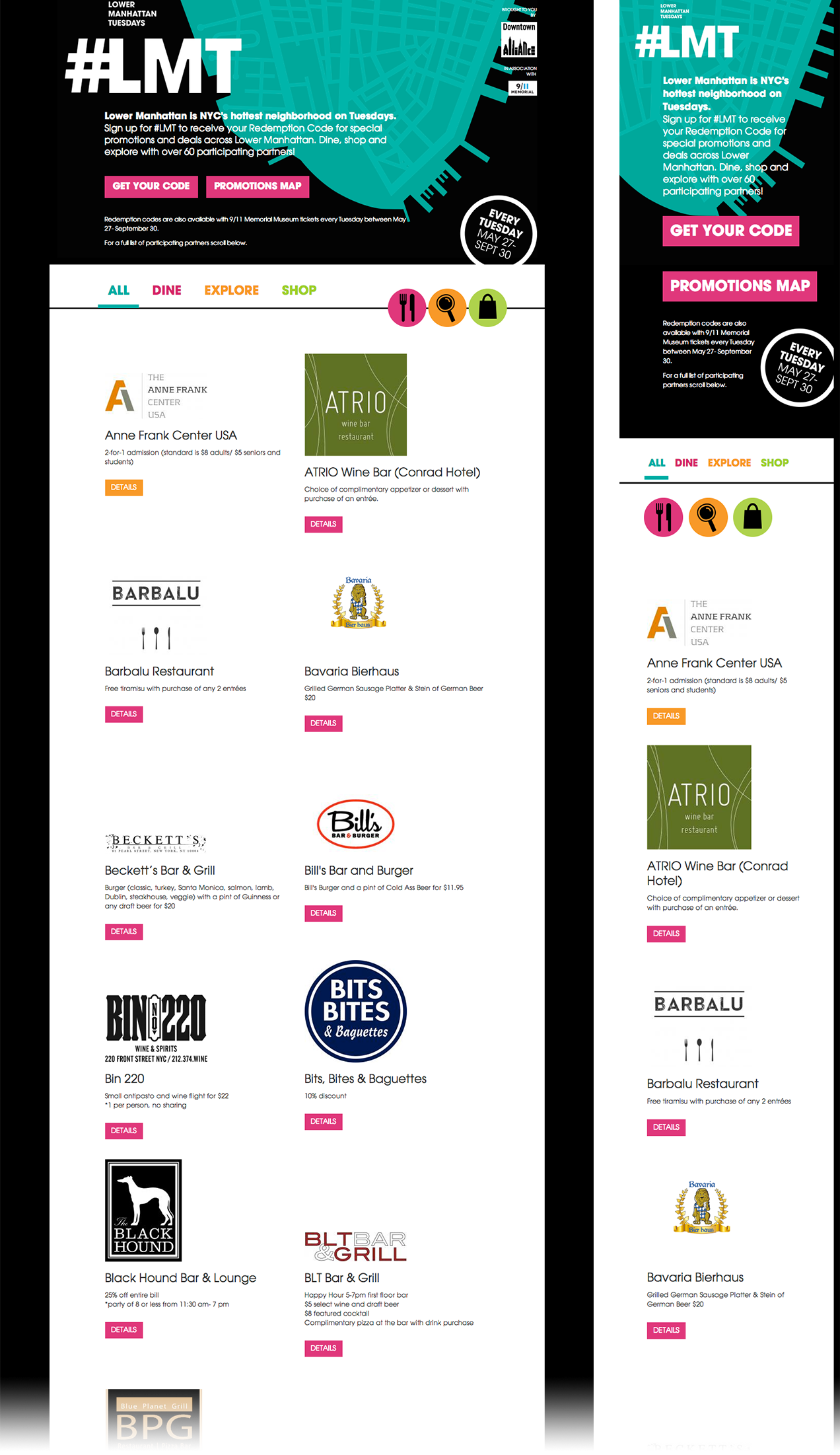
The first project is #LMT aka Lower Manhattan Tuesdays. Built in partnership with the Alliance and Barker, the website features over 60 partners across Lower Manhattan ranging in types from dining and shopping to “explore” partners such as the Anne Frank Center USA and Helicopter Flight Services.


lmt-screens-v2


I-SITE programmed the site for visitors to sign up and acquire a redemption code that they can use at participating partners every Tuesday between May 27th and September 30th.  Promotions include 25% off your entire bill at Black Hound Bar & Lounge, a surprise Wall Street related gift at Wall Street Walks, and a free cookie with a $20 purchase at the Salty Paw.  If you’re already out and about in Lower Manhattan check the fully responsive site out on your phone or tablet.

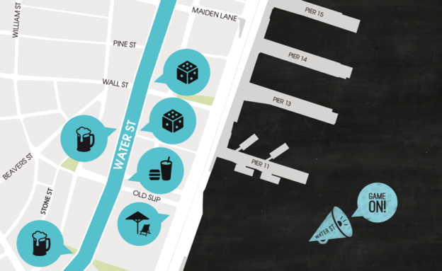
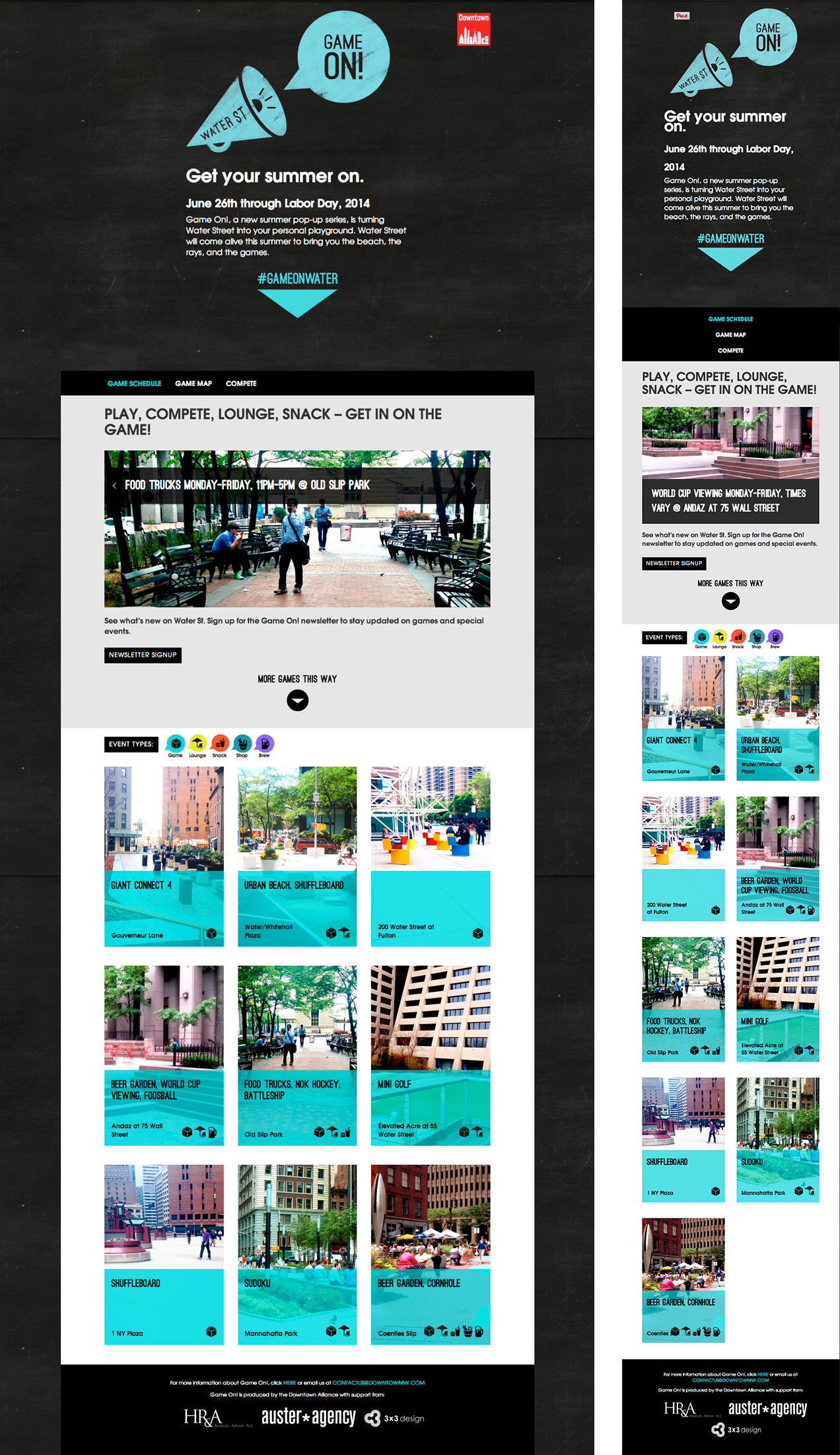
The second project, GameOn!, is a new summer pop-up series which highlights locations along Water Street and the games and events running June 26th through Labor Day. I-SITE worked with the Alliance and partners 3×3 design and HR&A Advisors to develop the microsite.


gameon-screens


GameOn! highlights a number of events including mini golf, beer gardens, and battleship and features a fully responsive design with a calendar and map of participating Water Street locations. While on Water Street, take advantage of the new Wi-Fi corridor that Downtown Alliance has also been tirelessly working on providing.

I-SITE built both microsites on the Drupal content management platform providing the Downtown Alliance with easy access for managing the content throughout the summer.

Liz Kelly, Exposed

Skills:

While I am certainly well-versed in many aspects of graphic design, my particular areas of expertise would be web/mobile/print design, UX, branding, exhibit design, and production.

Tools of the Trade:

My ideas usually come to life using all or any combination of the following in no particular order: a good pencil (Ticonderoga please), some graph paper, PS/AI, occasionally an Xacto knife, and my headphones that are most likely playing soul or dance.

What is your design process?

It usually starts with pin-pointing the problems which need solving, whether it’s getting a user to interact with a site in a certain way or creating something new and fun which elevates a brand.  I am inspired by the process of comparing and contrasting current examples and then I move onto creating a moodboard.  Next I begin sketching and wireframing, and my personal favorite – talking it out with anyone who will listen, even my 3 year-old beagle.  It helps to talk to people who know what I’m talking about, yet is refreshing to get the most inspiration or ‘brain spark’ from someone who isn’t a designer or developer… such as my (other) dog.

Where do you generate the most inspiration from?

Coffee. Beer. Bacon (and eggs. and cheese. on an everything bagel). Puppies. People-watching (doing my best not to be creepy of course). Everything, really.

Dream Project:

I would love to be involved in creating some sort of technologically innovative, interactive virtual presentation or exhibit in which the user is able to interact with a physical space.  I still have a love for the tangible print design world so merging the digital and the physical worlds would be awesome.

Future Design Prediction:

Responsive design for all.

Wild-card Question: If you could have a beer with any one person, living or not, who would it be?

Theres are way too many people to name but I feel like a conversation (over beers at a pub) with Ben Franklin would be the most ‘eye-opening’ and definitely super long…Dude knew something about everything!

Emails for Every Device

With more and more people reaching for their mobile devices, responsive design has become quite the buzzword lately. Many websites are now employing these techniques to present a layout that looks at home on a handheld phone or tablet, but is still able to stretch its legs and take advantage of the wider screens of a laptop or desktop display.

Because responsive design relies on modern layout techniques, javascript libraries and/or CSS media queries, HTML emails did not seem like a good candidate due to the restrictive nature of many email clients. A developer needs to party write their code like it’s 1999 in order to ensure that an HTML email renders properly on all clients (especially the painfully prohibitive Outlook, which uses a Microsoft Word rendering engine instead of a standard HTML one). Therefore, divs are sacrificed in favor of table layouts, the limited CSS tags that are fair game need to be written inline for every single element on the page, and background images are left on the cutting room floor. With all these barriers, how is one ever supposed to create a responsive email layout?

The good news is that many of these necessary evils are aimed at the lowest common denominator (ahem, Outlook), and a clever developer can still take advantage of CSS media queries to pass more robust CSS rules to mobile and tablet email clients (which typically are far better at handling more modern CSS and layout techniques). So while you’ll still want to leave your layout in tables and your styles inline for the Outlook crowd, using some fancy CSS targeting you can swap out content and formatting optimize for smaller screen real estate and retina resolutions. As for those stubborn table layouts, Antwort is an extremely helpful framework that can help you collapse those cells into a streamlined column.

Now that more than half of all American adults own smartphones and mobile is increasingly becoming the primary way that users access the Web, offering just one version of your content for all devices just isn’t going to work anymore. The era of ‘pinch and zoom’ to read emails and websites is coming to a close. To see an example of how I-SITE is adapting with the times, check out the responsive email layout we did for the Fuel Up to Play 60 newsletter. Be sure to visit on both your desktop and your mobile device to see how the same code uses the responsive techniques described above come into play. It’s even Outlook safe!

Need help kicking off your own mobile strategy? Give us a shout.

Wharton Web Conference 2013 Recap

On July 30th, members of the I-SITE team attended the 2013 Wharton Web Conference, hosted at the Jon M. Huntsman Hall, part of the University of Pennsylvania. This annual event is aimed at designers, developers, social media and ux professionals, and anyone else interested in improving the experience of technology for their users.

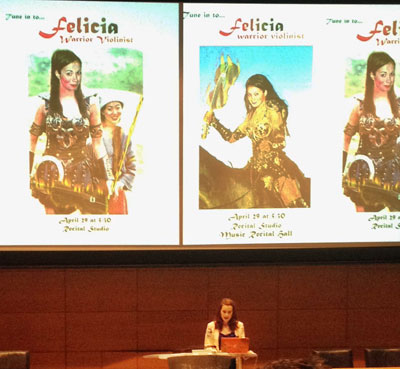
The event kicked off with a keynote address by Felicia Day, geek extraordinaire, who has appeared in viral hits like Dr. Horrible’s Sing-Along Blog and her own series The Guild, as well as appearances in geek culture classics such as Buffy the Vampire Slayer and Supernatural. She outlined her trajectory from her humble origins in Alabama and her education majoring both in violin performance and mathematics to her arrival in Los Angeles and her attempts to break into acting. Tired of being typecast as a “secretary-type”, Day eventually lost herself in an addiction to MMORPGs that later became the inspiration for her hit online series The Guild. The main takeaway of her talk was that when she didn’t find success in more mainstream channels, she delved into her own interests and built a robust career based around her loves of gaming, technology, and cheesy romance novels. Her stories about creating a show on a shoestring budget, running order fulfillment based out of her apartment, and shopping her content around without sacrificing creative control apply to anyone who believes in the DIY spirit to get their vision out to their audience.

Felicia Day, Warrior Violinist, talks about her college experience

After Day’s inspirational opening, the event broke into sessions that followed 3 tracks: Design, Development, and Culture. The Development track featured more traditional topics such as DevOps applications in IT and Web Frameworks, as well as the more experimental “Doing Things with Data” which featured Robert Carlsen giving real-time examples on how to use data streams from various input sensors (like temperature, or his own heartbeat) in an iPhone app. The design track also featured some relevant and timely discussions on accessibility and responsive design, which are increasingly important as people use a wider range of devices to browse the web. We didn’t make it over to the Culture track, but talks on how things go viral and

The event concluded with a happy hour on the top floor of Huntsman Hall, with a beautiful scenic view of downtown Philadelphia for everyone to enjoy and they talked about their favorite sessions and enjoy some tasty snacks and cold beverages. We offer our thanks to the Wharton School of Business for organizing such a great event and all the talented speakers for sharing their insights and getting us even more excited to be part of the Philly tech scene.

See you there next year!

How To Install RVM in Ubuntu Quantal

Here’s a post from our resident Linux nerd, Curt!

While trying to learn Ruby on Rails I noticed a lot of tutorials recommending RVM, and since Ruby is rapidly being developed, I agreed with them. RVM, or Ruby Version Manager, allows you to keep, and easily switch between, multiple versions of Ruby to suit your needs.

Since I had Ruby installed on my computer already (since I use SASS) I was curious as to how RVM would manage my system-wide install and the versions I was trying to install with RVM. The answer, unfortunately, turned out to be “not well at all.” So I first purged my system of ruby and ruby1.9.1 (along with my previous installation of RVM) so that I could start over and tell you all about it.

To start, if you type:

$ which ruby

and it returns anything but a blank line, you should run:

$ sudo apt-get purge ruby*

just to make sure we’re on the same page unless you have a good reason to not to.

Additionally, if you’ve played around with .rvm before and when you run which ruby you get output with rvm in it, you’ll probably need to run:

$ rvm implode

or:

$ sudo su
# rvm implode

as I did in my case, since the install contained files in directories that my used didn’t own explicitly.

Let’s Do This

I’ll be paraphrasing the step-by-step installation as outlined here in this section. This guide is designed for 12.04, but I’m running 12.10 and will alter any steps for the newer version as I go.

First, you need to make sure you have some packages installed. Open up Terminal and run:

$ sudo apt-get update
$ sudo apt-get install git curl

While Terminal is still open, go up to Edit > Profile Preferences, click the Title and Command tab, and check Run command as login shell. You’ll want to keep that enabled. Next, type:

$ curl -L get.rvm.io | bash -s stable

This downloads RVM and pipes it through bash for installation.

At this point, the RVM installation threw a warning to make sure I was sourcing ~/.profile inside ~/.bash_profile, or to add it to ~/.bash_login if ~/.bash_profile doesn’t exist. I added:

source ~/.profile

… to my ~/.bash_profile file.

Next up we source the newly created RVM shell script:

$ source ~/.rvm/scripts/rvm

And install more dependencies, including the most up-to-date version of nodejs:

$ sudo apt-add-repository ppa:chris-lea/node.js
$ sudo apt-get update
$ sudo apt-get -y install build-essential openssl libreadline6 libreadline6-dev zlib1g zlib1g-dev libssl-dev libyaml-dev libsqlite3-0 libsqlite3-dev sqlite3 libxml2-dev libxslt-dev autoconf libc6-dev ncurses-dev automake libtool bison subversion nodejs

And there you go, you’ve got RVM all ready to go! Let’s pop a version of Ruby in there! The tutorial I’m running wants me to use Ruby 1.9.3, so I will, but install whatever version you’d like!

rvm get head && rvm reload
rvm install 1.9.3

Now when I try to find out which version of Ruby I’m running, I get this:

$ which ruby
/home/meowsus/.rvm/rubies/ruby-1.9.3-p392/bin/ruby

I’ve got Ruby right where I want it.

Now to get the right version of Gem and Rails, which — again — is specific to the tutorial I’m using, which by the way is this one, so I ran:

$ gem update --system 1.8.24
$ gem install rails -v 3.2.13

And that’s just about it. You’ve got Ruby, you’ve got Gem, and you’ve got Rails!

EDIT: Since I had to implode my RVM install and start over, I was getting strange errors when trying to run bundles. It seemed like RVM would work properly for the current terminal session only after I ran:

$ source ~/.rvm/scripts/rvm

… each time I needed to do anything. Very annoying. To fix this, and a big ups to mpapis in Freenode’s #rvm channel, I ran:

$ rvm get head --auto-dotfiles

… then restarted my terminal.