
Stocked Fridge

First Day of Air Conditioning

Office Bike Races
What’d you do today?

Stocked Fridge
First Day of Air Conditioning
Office Bike Races
What’d you do today?

Last night Philadelphia’s Flash User Group and Coldfusion group hosted a meetup to introduce its community to their Ext JS and Touch frameworks. The Sencha product line allows developers to create robust web applications using core browser technologies: HTML5, CSS3 and Javascript. The great thing about this is that it provides the ability to use the same code base to provide both native applications and web applications cross platform. With the surge of mobile devices and the range of their specifications (ie. screen size, native language, browser types) the Sencha framework takes care of cross-browser and cross-platform nuances. This allows for fluid-resizing for different resolutions and orientations as well as specific ways of handling features on each device to make them as responsive as possible.

Photo by Rob Hall. @rhall
Thanks to these two groups for hosting the event and to Ted Patrick (@__ted__) for taking the time to give this lecture. For more information about the Sencha product line, visit www.sencha.com.
QR codes, Matrix Barcodes, Smart Tags, 2-D Barcodes, weird little crossword puzzle glyphs… whatever you call them, they are undeniably popping up everywhere. Originally developed in Japan as a machine-readable tag used to track parts in manufacturing, QR (Quick Response) codes are an improvement over the standard barcode we are used to seeing on everything we buy. The QR code can store a larger amounts of data. Now that companies are jumping on the QR bandwagon, we are seeing them appear on posters, advertisements, fliers, and even as graffiti stencils and stickers employed by tech-savvy taggers on sidewalks and bathroom stalls.
As with any tech fad, increased saturation of these strange little boxes raises a number of questions: “What are these things?” “Should I be taking advantage of QR codes?” “Do people even use these things?” Before you run out and start plastering the city with your own QR codes, I’d like to address some best-practice advice, based on things I’ve seen out in the wild.
1) Make sure your target user knows what to do.
Just because QR codes are appearing everywhere doesn’t mean it’s safe to assume that most people know how to properly activate them. One reason they are starting to take off is because enough people have access to smart phones that can run the applications required to scan them. But how many people know that you need a special application to read these codes?
I saw one embarrassingly bad example on a bank advertisement in a train station last year. The ad proudly displayed a QR code with the tagline, “Take a picture of this code with your phone to find out more!” I’m sure this misleading instruction led to more than a few confused users, as simply taking a photo of the QR code produces no result (besides a new photo on your camera roll). Any potential customer who did not know they needed special software to “scan” the code was a failed conversion in this example.
Another troubling usage was a pamphlet for computer training courses with the headline “Suffering from computer-phobia?!” The ad then featured a prominent QR code with the line “weekly courses starting now!”, implying that the QR code contained a link to signup. Now what computer-phobic person would be able to activate this QR code and sign up for the class is beyond me…
QR codes suffer from the same challenge as shortened URLs. While they are a more efficient way to package data, they don’t give the end user any clue as to what the end result will be (unlike a traditional URL, which if properly planned should give a user some clue). Unless you are using QR codes in an explorative nature, be sure to give the user some indication of what to expect upon scanning your code.
2) Make sure they work.
Once you have a user with the means and know-how to activate your QR code, and they are motivated to do so, make sure that the code actually works! Print designers have long known the value of triple-checking their work, because once something goes to print, no more edits can be made. Web designers, on the other hand, are constantly tweaking code, editing copy, changing graphics, and making numerous other adjustments. A website is a constantly changing and evolving entity (unless we’re talking about the Space Jam site, hello 1996!) When dealing with QR codes, web designers would be advised to take a print design approach, because once that code has been created and printed, there is no updating the data contained within.
I was recently waiting in a rather long line at a wine and spirits store, trying to kill time while waiting to make my way up to the counter. As I browsed the shelves in front of me, my eyes landed on an advertisement affixed to the shelf next to a bottle of top-shelf bourbon. The placard said, “See how we make each barrel of our fine whiskey” with a QR code next to it. I excitedly pulled out my phone to scan the card and watch the video, this being just the thing I needed to kill time. However, upon scanning, my phone pulled up a ‘404 – page not found’ error on their site instead of the video I was expecting. In my mind, in one second they went from tech savvy whiskey distillers to a company with embarassingly poor attention to detail. Any chance to convert me to a customer in that moment was immediately soured. So make sure your QR codes work!
3) Give the user an experience optimized for their device.
So you’ve got your user with the means and know-how, they are motivated to activate your code, and your code has been thoroughly tested and works as intended. They scan your code with their mobile device, and suddenly they are browsing a website optimized for a desktop browser. Your user is pinching and zooming to try and see your content. They’re trying to click buttons designed for a mouse, not a human finger. Maybe they get frustrated and just go somewhere else.
Let’s think about this for a minute: how many potential users will be activating your QR code with a desktop computer? If you answered anything other than ‘zero’, you’ve got some wild ideas about your potential users. So then why would you send them to a full size web page instead of something optimized for the screen of their mobile device? As obvious as this may seem now, I’ve lost count of the times a QR code has sent me to a desktop page. It gives the impression that you haven’t fully thought out your QR strategy. If your site has a mobile-optimized solution, point your user to that. If you don’t, this is a great excuse to get started with one!
So, where do we go from here?
These observations are based entirely on my own experiences with QR codes. I love the idea of the technology, and I hate to see it misused. Hopefully these points have given you a few things to consider before you move forward with QR codes in your next campaign, and you can avoid the obvious mistakes. When used properly, QR codes can be a powerful shortcut that gives your user valuable information.
I was recently shopping for a new stereo, and each product had a QR code next to it on the shelf. Scanning the QR code brought me to a screen optimized for my phone, with the full specs of each device and cost comparisons to other models. This is exactly the extra depth of information that can help convert someone into a customer (I walked out with a stereo that day).
And there are lots of other innovative uses for QRs that are coming out every day. They can be used for interactive tours and art instillations. They are showing up on apparel. People are even finding innovative ways to work their logo into a QR code. So when you have your breakthrough QR idea, contact us here at I-SITE and let us help you realize your vision in a professional and successful way!

Last Thursday, I was lucky enough to attend Paula Scher’s lecture at the UPenn School of Design. Paula Scher, graphic designer and a current principal at Pentagram, has worked in the design industry for the past forty years (and has never been bored with it a single day). She has a BFA from Tyler School of Art, and is the mind behind great identities including The Metropolitan Opera, Citibank, and most recently, Windows 8, and was also featured in the movie, Helvetica.
Scher walked us through the major influences of her designs, including her father (an aerial photographer mapmaker), making jokes out of complicated sets of information and illustration. She began her design career with an aversion for Helvetica and minimalist design, joking that she thought of it almost as a conspiracy between her teachers and her mother, as an extension of cleaning up her room. In her early designs, she was focused on creating elaborately-drawn illustrations.
She eventually began painting highly detailed maps from memory with a tiny brush. This work gradually got larger and larger, but with the same tiny brushes, resulting in wonderfully vibrant maps, with layers and layers of information forming textures. The maps were often her own perspective of that particular part of the world. They aren’t always accurate. She explained that just like any story, there’s always going to be something a little bit off about it. Some of her maps became politically-charged, such as one of Florida during the 2008 election. She has also experimented with how color changes the spirit of the content she paints. Her favorite city to paint is New York. She recently published these paintings in her new book, Maps.
In her professional design work, she explained that as she did more and more paintings of maps, her branding got simpler and simpler. She gave the example of the Friends of the High Line identity, a simple “H” that looks like a railroad. Scher said she would have never done anything this simple if not for her elaborate map paintings. Paula Scher concluded that without experimenting with painting maps, her design work might have never become as minimal as it is now. She said these two separate worlds (illustration and design) helped come together and she ended up with a balanced life of intensely detailed, textured map paintings and minimalist brand identities.
She stressed knowing where you are in the history of design because everyone has their own unique cultural vantage point. She ended with some fantastic advice for designers, especially regarding this technological age. “I worry about getting trapped in technological timezones. I think it’s important to embrace everything, but don’t assume it’s going to stay the same… a broad view and a personal perspective is always going to work.”
Images:
India (2007) acrylic on canvas
Paula Scher’s identity for Friends of the High Line

Last night, Steve and I attended “The Internet and IP Rights Enforcement: Current Landscape, Possible Future” event. PANMA assembled a panel of lawyers to inform attendees about the recent public backlash against the Stop Online Privacy Act (SOPA) and Protect Intellectual Property Act (PIPA), the introduction of the new Online Protection and Enforcement of Digital Trade Act (OPEN Act) in response to criticisms of the former acts, as well as other areas of IP law.
The panel’s presentation covered a broad range subjects in just under 2 hours, ranging from the differences between a copyright and a trademark to describing what the Open Act looks like and how it affects the future. The current environment of the Internet is essentially a “giant photocopier” (as paraphrased by one of the panelists), with data traveling back and forth between peers and servers, being copied over and over. People can so easily obtain copies of music, articles, photographs, software, and just about any other creative work. Balancing the free flow of information with protection for original content creators is a delicate act that governments around the world are still fine-tuning with treaties such as Anti-Counterfeiting Trade Agreement (ACTA).
After hearing the panel, I have a better understanding that the OPEN Act represents a new way of thinking about the legislative process. And even though you haven’t heard much about the SOPA and PIPA Acts lately, they are not dead. The next few months will definitely be an interesting time for Internet privacy and freedom.
If you want to find out more about the OPEN Act, you can view the full text of the proposed bill at keepthewebopen.com. You can comment and make suggestions to the author, just like a Wikipedia document. You can also subscribe to email updates about changes to the bill.

Monday night we took a stroll across the street to meet up with our friends of Indy Hall and Young Involved Philadelphia to celebrate the second annual #whyilovephilly campaign party, hosted at National Mechanics. As we wrote Valentine’s, Tweeted and Facebooked all the reasons we love the gritty city that Philadelphia is, we realized the most important part of the evening…bringing together creatives in our neighborhood. Philly is a unique hub of creativity and innovation and the #whyilovephilly campaign provides an opportunity for us to come together to continue to build positive and passionate pride around that idea in the place that we call home!
So, why do you love Philly?

If you’re on Facebook (which you probably are) we have our official Facebook Page up and running. Check it out at here. And if you’re so compelled, click that LIKE button.
Happy Friday!
On Friday, Steve and Sean-Paul from I-SITE’s development team traveled to New Foundations Charter School in northeast Philadelphia to speak to the 9th grade class as part of the Career Panel Assembly for Technology. Along with representatives from the IT company Pathfinders and Apple Inc., Sean and Steve spoke about a “typical” day at I-SITE (hint: there are no typical days at I-SITE!) as well as what steps they each took along their career paths.
Steve spoke about his introduction to the Internet and HTML code in high school, and his first job at the age of 15 redesigning and developing his high school’s website. Having built his first personal site using Notepad on his parent’s computer, Steve stressed the importance of researching tutorials online and the low barrier to entry in the field of web development. “People think you need expensive and complicated software to create websites, but really all you need is a glorified text editor to get started,” he told the class.
Sean further emphasized the key role that online tutorials play in building one’s programming skills. He stressed that “once you learn the core concepts of programming, it’s just like any language. You just need to know the syntax. If you know the language computers understand, it’s all just logic from that point.” Sean also brought up the most important factor to success in this (or any) industry. “Just do what you love. If it’s something you’re interested in, it’s not hard to motivate yourself to put in the time it takes to learn.”
The students asked the panel questions they had prepared, ranging from, “How important is my GPA to get into this industry?” to “How do websites make money?” All of the panelists had a great time giving the students a window into their careers and encouraging them to look into the diverse opportunities in the technology field. The panelists agreed that the most important factors in this field were teamwork and collaboration, problem-solving, and the ability to “produce” something. Because no matter how many tests you take in school, when you get out into the job market it’s what you’ve produced that will demonstrate your true level of ability and may be the deciding factor in landing your dream job.
Based on the curiosity and attentiveness demonstrated by the students, the next generation of IT professionals is already off to a good start!

What’s the difference between dark wave, cold wave, minimal wave, new wave, new new wave, and all those other genres labeled with the famous last word wave? Who knows! But Jessica’s music mix melds them all together into a play of waves. Perfect for I-SITE music mix no. 13. Listen now!

Oppenheimer Analysis
Listen Now: I-SITE Radio
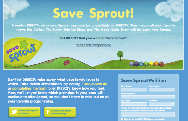
The I-SITE team has been partnering with PBS Kids Sprout on a variety of new and exciting projects. This week we launched the Save Sprout! site which has immediately shown great success! Sprout reached out to the I-SITE team to create a one-page site with a purpose. The goal is to inform Sprout’s viewers of DIRECTV’s decision to restrict access to the Sprout Network and request viewers to take action by letting DIRECTV know how important Sprout is to them and their families.

I-SITE’s role in the site involved making design updates, developing the site and being ready to launch at a moment’s notice.
The Save Sprout! site launched this past Tuesday and within 24 hours of launch it received over 28,000 visitors and has helped to reopen negotiations with DIRECTV.