Author Archives: admin

Startup PHL Comes to Old City

This afternoon I-SITE welcomed a group to tour our office and get a chance to see what we build and design. We were one stop on the Old City Tech Tour that Mayor Nutter helped to lead after announcing a $3.5 million investment from the City of Philadelphia and the Philadelphia Industrial Development Corporation, called Startup PHL.

The focus is to attract and retain tech startups and fuel the city’s nascent innovation community. The initiative features $3 million from PIDC to be matched and managed by a private investment fund for early stage tech startups and $500,000 in grants for entrepreneurial focused innovations.

Luke Butler, Nutter’s assistant commented on the initiative: “We’ll see more companies started in Philadelphia, more companies that would have left staying in Philadelphia, more venture capital flowing into the city, and just an even further amount of programs and activities that support startups and entrepreneurs.”

We hope the visit to I-SITE helped to encourage visitors to continue to grow this effort and build Philadelphia into a stronger tech community!


Tour the Web with Culture Quest

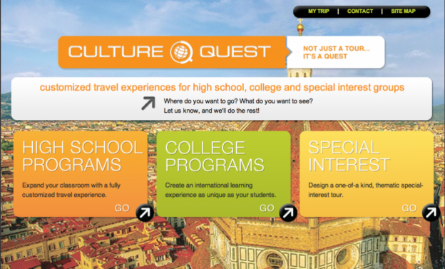
I-SITE  is proud to announce the launch of their latest website, fellow 15 S. 3rd Street residents, Culture Quest Tours!

Culture Quest- an educational travel company, was looking to update the look and functionality of their site, in order to give their clients or potential clients an enjoyable experience online. I-SITE helped to accomplish just that! how to recover failed transfers files The updated site, features several categories to help get you directly to the information you are looking for.

Whether you are a teacher interested in taking your students abroad, a student who just signed up for a tour with your school or a parent interested in the details of your child’s trip, the site offers categories for each group. It goes one step further and even breaks down into separate sections for High School students, College students, or Special Interest Groups. These options make the site extremely functional, efficient and easy to maneuver. how to recover excel file not saved 2007

And be sure to stay up to date with Culture Quest travels through our social media buttons and new blog feature!  Happy travels!


I-SITE Gears Up for The Switched-On Garden 002

Data Garden’s Switched-On Garden 002 event is right around the corner! I-SITE’s Abby Fretz and Kara Bergman have been working hard with this unique record label’s co-founders, Alex Tyson, Joe Patitucci and Data Garden partner [aka I-SITE CEO] Ian Cross to prepare for next Sunday, October 14th and it’s finally here!

Spend your afternoon wandering through Bartram’s Garden and connect with their natural environment through live music, performance and sculpture that blurs the distinction between biological and digital worlds. Stumble upon Art in the Age of Revolution pouring their signature hard apple cider, Little Baby’s Ice Cream truck scooping their hand-made ice cream and test out the newest gaming skills with our friends at Cipher Prime, all along the way.

Stick around into the evening and enjoy a Dogfish Head draft poured by the one- and- only Trestle Inn, as Philadelphia producer and composer, King Britt explores sound design, noise and ambient. Christopher Sean Powell (Man Man) will also make an appearance and team up with Data Garden to bring you the maiden voyage of Spaceship Aloha.

And be sure to stop by and say hi to your friends at I-SITE, who will be helping to manage the event alongside Data Garden throughout the day and night! See you then!

RSVP here.

I-SITE Wins Two W3 Awards

I-SITE just got word that two of our projects have been selected by The International Academy of Visual Arts to receive a 2012 W³ Award.

We were awarded a gold for our Sprout and Lego holiday animation (in the “Video – Branded Content:Business to Consumer” category)  and a silver for the Downtown NYC iPhone App (Video-Tourism category).

For the holiday season last year, we worked with Sprout, a preschool television channel offering extensive educational programming, to create a Sprout-Lego 15 second animation featuring some of I-SITE’s favorite feathered friends.  Stay tuned for a sequel to be released this 2012 holiday season – our feathered friends make an appearance (steal the show) again!

We developed the  Downtown NYC iPhone App for the Alliance for Downtown New York. Version one featured event listings of everything happening in New York’s Lower Manhattan. More recently we launched version 2.0 which included improvements to the Where To Go section, the addition of favoriting, and search functionality. Users of the Downtown NYC app receive In App Alerts with vital information about Lower Manhattan.

I-SITE gets cozy with the Pajanimals

Even if you don’t have preschooler in your home you were a preschooler once! I-SITE recently teamed up with our friends at Sprout to create interactive media to engage families and promote Kimberly-Clark’s Nighttime Pull-Ups.  The goal of the campaign featuring the rather cuddly Pajanimals is to drive parents from SproutOnline.com to the Nighttime Pull-Ups website.

I-SITE designed and developed promos that establish bedtime rituals in a fun way. The multimedia promos feature a Pajanimals video and PDF downloads of printable activities.

The project is one of a number that I-SITE is currently working on with Sprout. Stay tuned for more and don’t forget to tune into Sprout as well!


Protecting the Mountain Gorilla

In 2010, the I-SITE team launched iGorilla, the first iPhone app with the sole purpose of supporting the plight of Africa’s endangered mountain gorilla. Since its release the app has told the amazing stories of Eastern Congo’s gorillas and highlighted and supported the work of the staff in Virunga National Park. The app was a big hit and was even featured on the BBC website home page.

The habitat of the remaining 720 mountain gorillas borders three countries – Rwanda, Uganda and the Democratic Republic of Congo. Unfortunately the region has been a war zone frequently in the last few years and the situation has been especially volatile since the Rwanda genocide in 1994. Many of the brave rangers who patrol the park and protect the gorillas have been killed in recent years. Our app along with the Virunga National Park website has been a great help in raising awareness. Emmanuel De Merode the Park Director and his staff blog almost every day to iGorilla app with stories, photos and videos.

On Sunday, July 8, much of Virunga National Park was overrun by rebel units. With rebel troops bearing down on Virunga National Park headquarters at Rumangabo, the decision to evacuate all ranger families had been made. Rangers need to continue their work of protecting the mountain gorillas, and a refugee camp must be built and maintained for their families. Emergency funds are needed to provide proper shelter and a level of sanitation that will prevent outbreaks of cholera and other deadly diseases. Emmanuel and his staff need our help more than ever.

Join us in supporting the park by downloading the iGorilla app. 70% of the $3.99 purchase of the app will go to the Park. Also check out the compelling video that Emmanuel and his staff put together about the park and the current situation.


Breaking Bad: How To Plan For The Changing Web

When I first started designing and building websites, the standard was to design for 800×600. For those not familiar with this convention, it meant to expect the screen resolution of your users to be 800 pixels wide by 600 pixels tall. This worked for a while and all was fine, but then as display technology advanced, what looked good at 800×600 now looked tiny on a larger display. So the rule became “design for 1024×768”, then “design for 1280×1024”, and an obvious problem emerged. People weren’t wrong for designing specifically for these sizes; the numbers backed them up. Up until even 2008, about 56% of internet users were viewing their websites at 1024×768 or lower. It made sense to invest your time in designing for what the major population of the web would see. The problem with this philosophy was, of course, that would not be the major population for long and within a short time you would be designing your site yet again to be tailored to the masses.

Currently, screen resolution statistics are all over the place, but here is a bit of a break down so you can get an understanding of what is happening:

  • 800×600 – 1%
  • 1024×768 – 13%
  • 1280×1024 – 18.7%
  • 1280×800 – 11.5%
  • 1920×1080 – 8.1%
  • 1440×900 – 8.1%

Statistics from W3Schools.

The problem has become that there is no standard screen resolution to design for, and to add to the problem the increased use of mobile and tablet devices has completely changed the way some people use the Web.

To address these problems, Adaptive and Responsive design came to the rescue. Adaptive design is a technique of creating different layouts, or styles, for each of the resolutions you expect your users to have. An Adaptive Design might include a layout for 1920×1080, 1024×768 , and 320×480 (iPhone screen). While this solves the problem of displaying the same content to 3 users sets, it still subjects those that are running at different resolutions to a poor viewing experience. Responsive Design looked to help solve that problem even more effectively, by adjusting elements on the screen to be responsive to the screen it’s being viewed on. A similar problem arises with responsive design though that many of those who implement it still use screen resolutions as a basis for when their design should shift. They are putting the wagon in front of the horse.

When designing for each resolution, the different screen widths are commonly referred to as “break points.” The problem much of the time is these are not the places where the design actually “breaks,” or stops effectively working within that given space. This is what I like to refer to as “Breaking Bad,” using screen resolutions as a guide to adjusting your design as opposed to really analyzing your layout and seeing where it needs to be changed. Many times these widths won’t directly coincide with a current popular browser width. It is important to realize that this is a good thing, though. Much like back in 2002 when designers were told “800×600” or “1024×768”, using these numbers as key breaking points roots your design in to current display technology.

It’s hard to predict how a person in 5 years is going to be using the Web and in what situation. Designing a site now requires you to not think so much about the specific widths and heights, but more about the situational applications of your site. A visitor viewing it on a smartphone has different intentions then a tablet user, and a desktop user, and so forth. With more and more internet-ready devices becoming available, it’s going to become “how does my site function on a TV, on an LCD on a refrigerator, on a full touchscreen table top?”

Plan your site to work at every resolution, not by creating 100 different implementations, but by properly identifying where the break points are in your layout and building a way for page elements to adjust accordingly. Avoid “breaking bad” and watch your site adapt to whatever new resolution lies just around the next bend.

Jake Haut Exposed

Skills:
Java, Android, and C++ is basically what I know most about right now, but I am learning more each day. I’ll learn much more once I start college.

Tools of the Trade:
I use Eclipse for programming Java.

Project most proud of:
Since this is my first job in the industry and I am starting college in about a month, I don’t actually have any projects at this point.

What is your development style:
When I have something I need to get done, my method is to just sit down and tackle it head on. I like to deal with any problems as soon as they appear – I don’t like to leave errors in my code.

What makes the perfect client:
Someone who knows what is involved in the development process and the difficulties that can come from that.

Dream project:
I think it would be cool to work on some sort of game, since I play a lot of video games and it would be interesting to learn what goes into making them.

Future technology prediction:
It seems that pretty much everything these days is connected to the internet, so I’d say that the future of technology is going to be all about constant connection and integration.

Beer Friday: Labor Day Edition

It’s Friday, which means our I-SITE fridge is stocked! And with Labor Day right around the corner, what’s a better way to begin the holiday weekend than to indulge in a tasty 21st Amendment can of Hell or High Watermelon while reflecting on the summer or a cold Stoudts Oktober Fest to celebrate the beginning of fall!

Cheers!

Planting Technology in the Garden

Data Garden is back for another year of celebrating plants, music and technology in the garden, Bartram’s Garden that is. And I-SITE, a fan of all these components is proud to be sponsoring the second annual event! I highly recommend this guide to adobe flash recover file anyone who finds themselves in a similar situation.

Mark your calendar for Sunday, October 14th when The Switched –On Garden 002 sets up at the oldest surviving botanic garden in North America. Participants will have the opportunity to wander the garden and connect with their natural environment through live music, performance and sculpture that blurs the distinction between biological and digital worlds.

I-SITE definitely plans to attend after deciding to sponsor the event and working hard to build the Data Garden website, which recently won the IMA Outstanding Achievement Award in the category of ‘Music.’

The Outstanding Achievement award is the second highest honor bestowed by IMA- The Interactive Media Awards and an extremely challenging award to win.  It proves that the site reached excellence in planning, execution and overall professionalism.

View the award winning website here and check back for the list of artists performing at this year’s event at the end of the month. To invite friends and RSVP, head over to the Data Garden Facebook event.